
AI-Enhanced UX Core
Leveraging AI Across Design, Content, and Evaluation to Optimize Every Stage of Delivery
Build intelligent, efficient design workflows
Integrating AI across image generation, UX writing, and usability evaluation. Deliver optimized outcomes with reduced effort and faster turnaround.
My Role UX Strategy, AI Workflow Design, Image Content & Evaluation
Duration: 2 months
Goal:
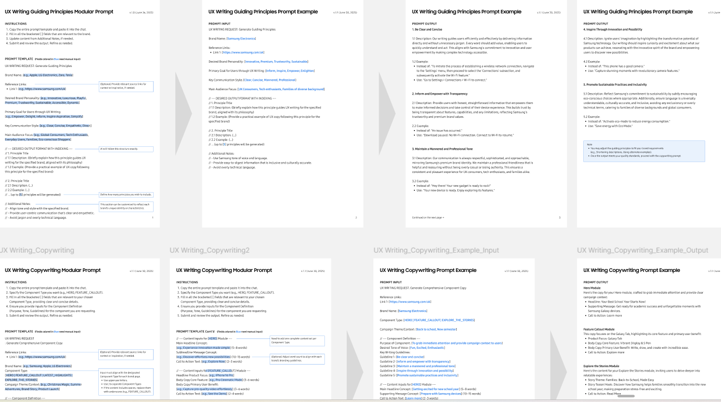
AIX is a future-ready UX framework powered by AI. By integrating AI into content creation, writing, and evaluation, the project reimagines how designers work—achieving more with less time, without compromising quality.
My Contribution:
I led the UX direction for this AI-powered initiative, focusing on integrating generative tools into real workflows. My role spanned from defining modular prompt templates for image generation and UX writing, to building evaluation flows that optimized output quality. I collaborated cross-functionally to prototype, test, and refine an AI-enhanced UX process that reduced turnaround time while maintaining design integrity.
Get StartedDesign for impact. Build for scale.
We created an AI-powered UX solution for teams working under pressure. Our goal: streamline workflows without sacrificing accessibility or quality.
The challenge? Users with varying digital skills all needed fast, reliable results.
The solution? Smart tools that empower teams to create, write, and evaluate at scale.
How can design teams leverage AI to compete with larger agencies while delivering high-quality UX at scale?
✅ Core AIX – Background & Goals
This project began with a clear need: help internal teams under pressure work faster without sacrificing quality.
By analyzing current workflows, we identified repetitive and time-consuming UX tasks across three key areas — image generation, UX writing, and evaluation. The goal was to develop a modular, AI-assisted process that empowered teams to focus on creativity, not just execution.
Unbanked Americans : Those who don’t make use of any banking services
Problems:
No access to digital banking
Way to many fees/fees are too high
No savings
No path to financial growth
Underbanked Americans: Around 20% of Americans are underbanked (~33% are millennials) according to the FDIC, which means they have either a checking or savings account, though rarely both.
Problems:
Limited / no credit visibility
Poor financial health leading fees & poor budgeting habits
Little to no savings
not using a full range of banking services

Persona

Connecting the dotsFinancial institution problems
Small local bank/ credit union
Limited resources and product offerings
Mid-sized bank
Limited digital resources, incentives benefits to compete with big banks
FI opportunities/goals?
Expand the demographic they serve
Retain customers (prepaid card users leave after 6 months on a card/product)
Convert customers to traditional bank users
Digital offering that allows them to compete with big giants
👉 DBX can help deliver a tailored experience to customize the feature set to make users feel at home. Mid-sized banks take the personal connection to their customer’s value into the digital space
DesignBring UI design into a better product
I started worked with other designers to prototype the new screens and UI visual refresh. This stage, where a lot of back and forth happened, spanned across the entire app & web project. I discussed the overall product vision with the design director, and POs prototyped and tweaked UI treatments with designers.
Color palettes

These new upgraded colors provide clients a more dynamic look, which enables customization to match FI’s brand colors.


deliveryKeep on iterating with user feedback for product excellence
Dashboards (one account)
New quick action icons highlight the big change to the dashboard. A slight pattern in the back of the available balance card has been added to match the splash screen pattern.
Nudges have been sized a bit larger and have graphics remove to place focus on the communication and call to action. This section has been named “My updates” and a badge to indicate the number of nudges added. Pattern matching our login screen used to tie visual language together.
Spending insights now come with more vibrant system colors to help catch user’s attention.

Hub screens
Layout has been re-designed to reduce whitespace and make each menu item look more tappable. Each item contains a quick action that is brand configurable. The hub screen has the flexibility to be split by pay & load features, or can be combined for just one hub for all money movement features.

addressing feedbackNavigation Testing
To decide which concept to suggest, we conducted the First Click Test
Measure where people expect to find X
Understand user expectations for feature location
Collect insights on expectation vs reality
understand the thought process for locating a feature
How we collected insights
Conducted first click test with 10 participants
showed 5 participants Concept A, 5 Concept B
Gave them two tasks - collected feedback on where they would click and why
Gathered their reactions to screen compared to their expectations
Why only one test?
Eliminate bias from order concepts are shown

Task one
You need to pay a bill that’s due tomorrow. Where would you tap on the screen to begin the process of paying your bill?
Task two
Your account balance is low and you need to transfer money into your account. Where would you click to begin this process?
Synthesizing resultsHow we did it
We logged feedback collected from interviews on a google sheet, then individually reviewed results & noted our own insights. Affinity mapping created with each individual’s insights- looking for trends/overlaps. As a result, we collaboratively landed on a decision with the help of insights

Synthesizing results #2Insights gathered
Deposit & Pay labels were somewhat confusing or misleading
Users expected multiple features to be nested inside of Move Money
Direct deposit adds confusion and a sense of uneasiness (4/10 mentioned)
A user found our app to seem easier and simpler than their current banking app (7/10 mentioned)

The Verdict
Merge tabs into “Move Money”
Clarity: Reduce the need for users to decide which tab to tap
Versatility: Works well for when we have few options as well as many
Simplicity: Makes White-label configuration easier, consolidates two variables into one
Assistance: Use section to assist in finding right feature

TakeawaysCollaborate and be visible
Effective and efficient communication with cross-functional roles was one of my big takeaways. I also learned how to make my rationales and work visible as a designer to the larger team to get feedback from more comprehensive perspectives.